 Every design element involves shapes and shadows but most importantly it also includes color. The human eye can see a combination of seven million colors. While some colors have a soothing and lasting effect on the viewer, others can irritate the human vision. Using color in an appropriate manner can maximize the effectiveness of your design. Take the color into consideration as you plan the design of a new wall mural, wall paper or signage for your property, home, building or business.
While the following details some general facts about colors, keep in mind that some exceptions might apply where the use of some color combinations might generate stunning designs:
– Yellow could be considered the most irritating color. More light is usually reflected by bright colors which results in excessive stimulation of the vision. That being said, lighter shades of yellow can be comforting and cheerful. Yellow catches the attention of the viewer. So keep it in mind as a color but also consider the space/area and shape of your design.
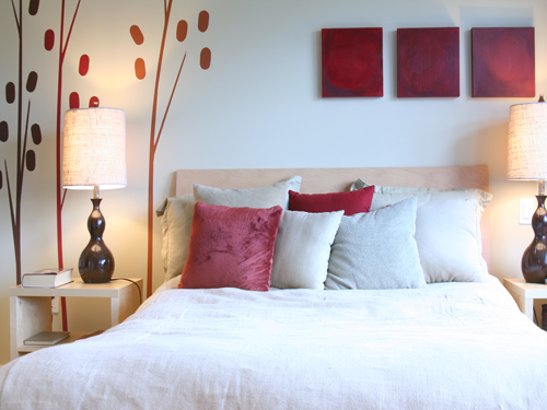
– Red is another color you want to pay attention to. This is a color that could fatigue the eye quickly. With over 250,000 decoding cones, your eye uses 83,000 cones to decode the color red and become over stimulated causing the opposing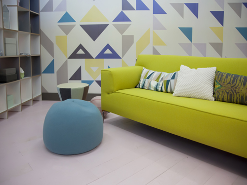 cones to kick in and shifting the way the red color is seen.
– Green is a color that might evoke the sensation of nature and the smell of grass.
– Pink is one color that could cause a sense of sweetness.
– As for the color grey, you may experience sensations related to smokiness.
– Using white and black to create contrast might also result in an excessive muscular activity which will fatigue the eye of the viewer.
A graphic design company or an interior designer should be able to help you figure out a solution enabling your designs to focus on the visual and aesthetics in order to create positive, productive and long-lasting impressions.